If your business doesn’t have a great landing page, it’s time you get one!
Why?
Because landing pages are integral part of increasing profits for any business in this digital world. It serves as a magnet that turns leads into prospects and prospects into loyal customers.
But what is a landing page?
A landing page can be your homepage or a standalone page created to increase the business sales. This is where you want your prospective customers to ‘land’ on. The landing page is no ordinary webpage of the website. It is the face of the brand that entices customers to take that necessary step to indulge with the business.
Having the most effective landing page amongst the competitors is of essence. And to achieve this, you have to create the best landing page design!
But what makes a landing page design great?
At the end of the day, a great landing page design can help establish a valuable relationship with your customers. Some of the best landing pages out there have the following elements:
- A great headline that grabs the interest of the viewers.
- An effective call-to-action (CTA). In fact, a study found that 90% of viewers who read the headline, will also read CTA.
- An animated explainer video that provides great value to the customer.
- Great aesthetic appeal to set the right tone.
- High quality photos of the products/services.
- Mobile optimized landing page design. Since most people will use their mobile phones to check the brand out- optimized mobile sites are necessary. 80% of the top landing pages are mobile-friendly.
- Customer testimonials to reaffirm the buyers’ trust in the brand.
- Good copy that would entice the customers to buy.
Though creating landing pages is extensively adopted by businesses across the globe, only a few have hit the mark, making it work effectively. Let us see some of the greatest landing pages out there that made it work.
Amazon
Amazon’s landing page design is exceptional. A study showed that the average conversion rate for the top 500 online retailers was 3.32%. The average conversion rate on Amazon was 13% for consumers who do not have a Prime membership. And Prime members converted at a whopping 74%!
What Amazon did is:
- They placed the CTA right at the top of the page so it can’t be missed by the viewers.
- They used an explainer video to provide more value to the customers.
- They featured movie stars for a touch of influencer marketing, that we know works great in increasing the audience reach.
- The messaging uses exclusivity and incentives to encourage conversion. It also speaks directly to Prime users.
- The page ended by funneling visitors to other similar products (alternative conversion opportunities).
Uber
Uber’s landing page design is top-notch. Minimalistic yet appealing to the eye.
What Uber did is:
- They included a headline that addressed an apt pain point – work schedule inflexibility. This simply gets the viewer hooked.
- The form is placed high up on the page to avoid getting missed and also giving visitors the opportunity to convert right away if they want.
- The page incorporates clear and concise copy.
- Uses great visuals.
Snapchat
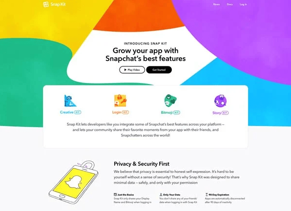
What Snapchat did is:
- The landing page has great color combination that is appealing to the eye. As color psychology plays a great role influencing the consumer’s perception and emotions about the goods- Snapchat did a great job making the landing page design attractive.
- Incorporated explainer video to reinforce the idea.
- Used animation graphics to illustrate functionality of the app.
- Simply explains what the app does- providing value to the user.
Squarespace
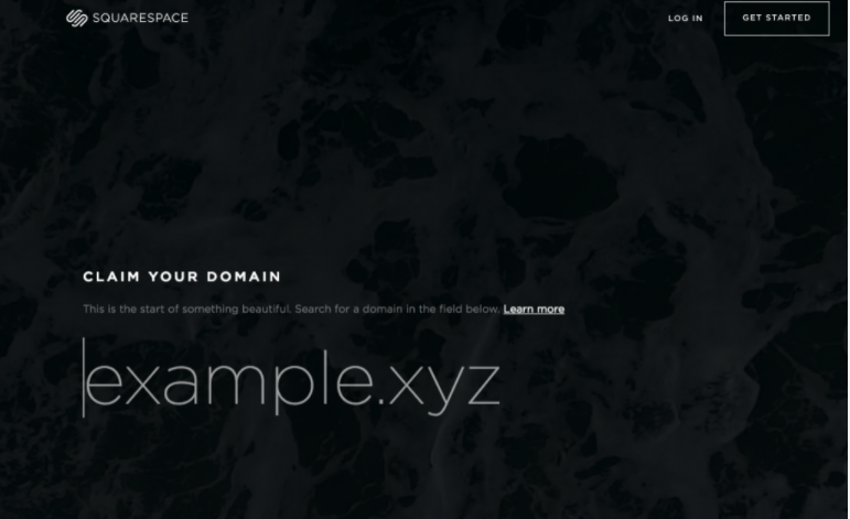
Simple yet intuitive, this is another great landing page design.
What Squarespace did is:
- “Claim your domain”. This is a great headline as it has a sense of urgency.
- Small pieces of copy make the content easy to go through.
- The use of appealing font throughout the landing page gives it a professional vibe.
- The “Learn more” link in the subheading acts as an anchor tag sending people further down the landing page to know more about the offer.
TransferWise
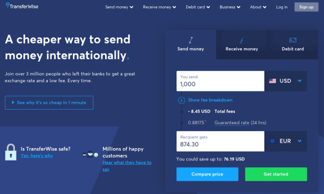
As the name suggests, TransferWise allows the users to send and receive money in different currencies. The landing page focuses on making their customer’s process hassle free.
What TransferWise did is:
- They added a vivid blue color theme that creates a sense of calmness (according to color psychology) in the viewers, so that they don’t start worrying about it being a troublesome process.
- They separated each individual action so the viewers are not distracted by the options that don’t apply to them.
- Each tab on this landing page produces a different call-to-action based on what the person is signing up for — each of them in a vibrant green box to highlight the next step after the three possible starting points.
- Clean, sharp and overall symmetrical landing page design gives the customer a professional vibe.
Constant Contact
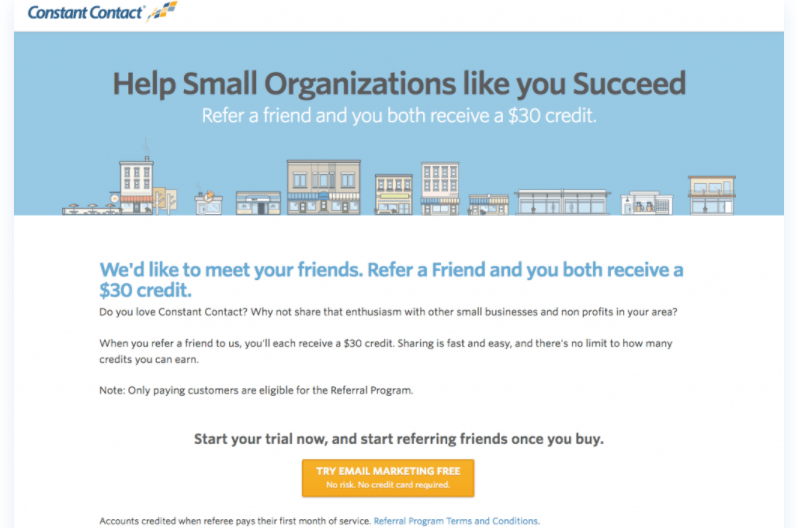
What Constant Contact did is:
- The heading & the subheading are both benefit-oriented and support each other well.
- Short & crisp copy allows viewers to understand the offer without overwhelming them with excessive content.
- It has a great landing page design. The Contrasting orange CTA button stands out well within the rest of the page, and along with the engaging CTA text, it tempts the viewer to click it.
Basecamp Bonus
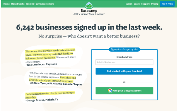
Another brand that got their landing page design right.
What Basecamp Bonus did is:
- They have simple sign up option: by email or Google authentication. As people dislike complex sign-up option that ask a lot of details, Basecamp makes the process simple.
- Provides customer testimonials and stats. This persuades the potential customers to actually convert.
- Shows how they can help increase your efficiency.
Airbnb
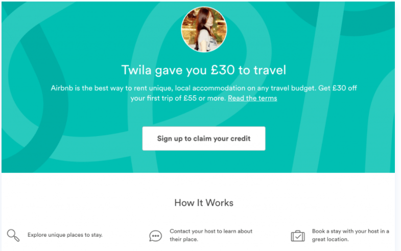
Airbnb nailed their landing page! Their landing page design is not only minimalistic but it makes the viewer take the desired action.
What Airbnb did is:
- Right from the start, the headline easily grasps the viewers’ attention by offering a cash incentive.
- Well contrasting CTA button placed in the centre gives the landing a page a clean look.
- Explains how the Airbnb booking works, in three simple steps.
Nauto
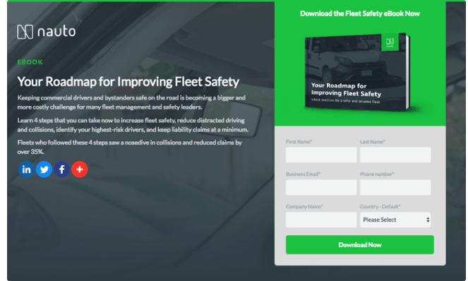
Nauto, a data platform for self-driving cars, helps make autonomous driving safer for companies who manage fleets of self-driving vehicles. Naturally, its customers would need all kinds of information to sell them on this platform. What Nauto did is created an e-book for which they further created a landing page.
What Nauto did is:
- The landing page design is appealing to the eye.
- Different social media icon link to establish an increased online presence. This also increases credibility of the brand, as it can be found on more than one platform.
- A strategically green CTA “Download Now” button (on the road, green means go).
- Informative yet an effective heading that quickly grasp’s the viewer’s attention.
- Small pieces of content to explain the viewer, why they should download this e-book.
Todoist
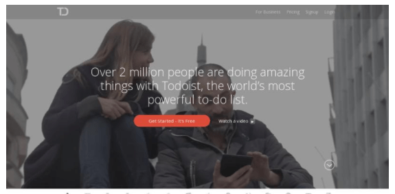
What Todoist did is:
- Saying “over 2 million people are doing amazing things with Todoist” provides social proof that a lot of people love using this app.
- Clicking the red CTA button pops up a form that says “sign up in seconds” with third party authentication available.
- The background shows different short videos showing variety of scenarios in which the app can be used. This provides value to the viewer.
There you have it — some of the world’s leading companies with some of the internet’s best landing page examples!
As a leading digital marketing and web development company, Communication Crafts have valuable experience in this industry that we leverage to create the best landing pages for our clients all around the world. With the best graphic designers, SEO experts, UI/UX specialists, expert app developers working around the clock- we craft the landing pages to perfection that in turn help increase your conversions. Being pros at designing landing pages, we simply know how to attract more customers towards your business. We provide a superior scope for your business to grow in this digital age! Customer satisfaction is of utmost importance to us and we strive to live by it.
Ready to increase your conversions? Hire us and make it happen!
Looking to get your landing page to finally work?
Look no more!
 Blog Communication Crafts